Alten Sakai, CPAs Branding


Description
Sedona Group Media
Create a new brand for Alien Sakai, CPA firm.
Branding Items
- Logo / Identity
- Business Cards
- Letterhead
- Social Media Icons
- Branding Guide
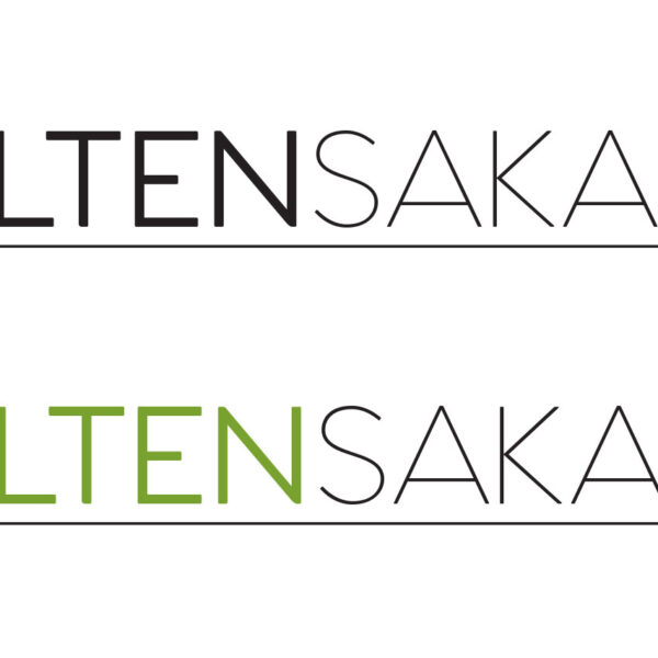
The client was looking to refresh their brand to attract a larger variety of customers. The second slide shows the old logo, which expresses more reserved and traditional times.
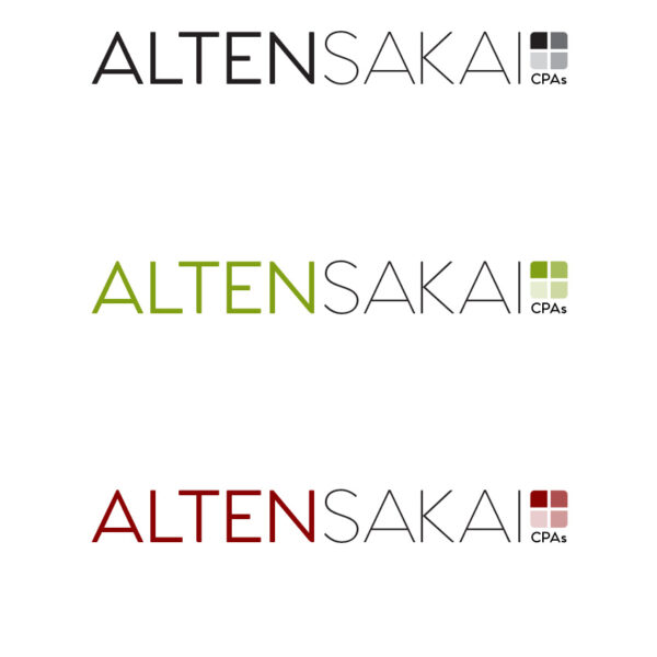
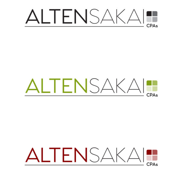
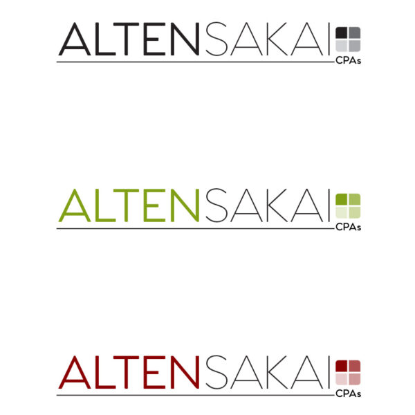
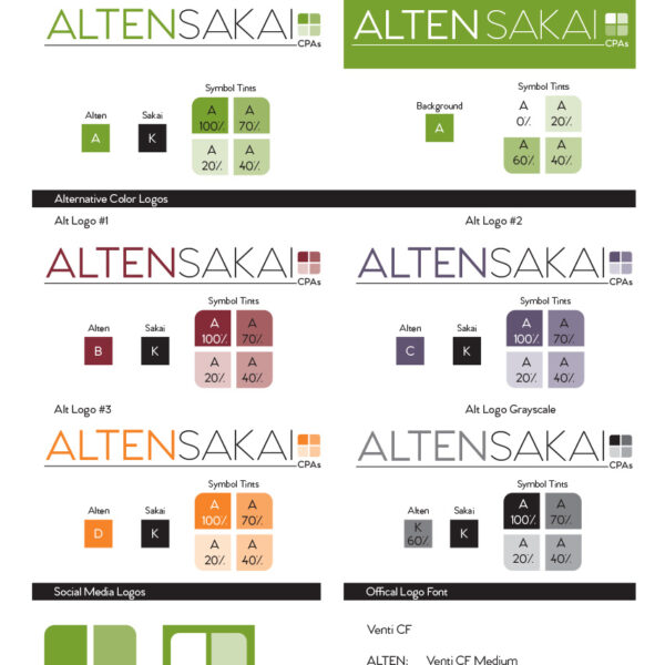
The third, fourth, and fifth slides show the progression on where to add in the "CPA" and "quadrant" graphic. They liked the rule added in on the fourth slide, but I didn't like how it felt dangling, so I tied it in tighter to the right and extended it the slant of the "A" on the left, of course making sure it lined up with the horizontal line of the "A" in CPA.
Challenge
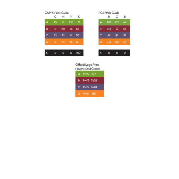
Color was challenging for the branding team at Alten Sakai as they all had their opinion on the colors they each liked best. We settled on the brighter green, for it represents money, health, nature, and harmony and was a stronger message than the deep maroon. We did end up adding in two more alternatives in the final branding but encouraged to not use them except for more internal projects. You can see the branding guide on the last two slides.
Final Thoughts
I enjoyed this project because it was nice to see the final brand welcomed by the client as they were excited to move to the phase of their brand and image. It's nice to see the client proud of their new identity.