Sedona Group Media
Description
Sedona Group Media
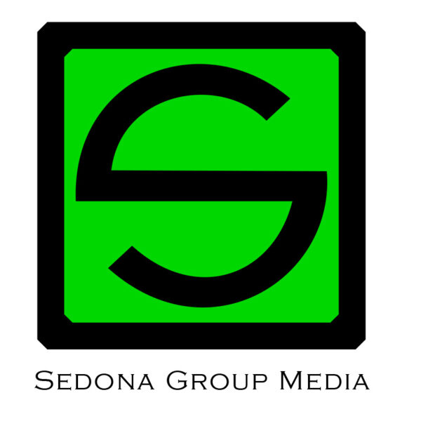
Logo design for Sedona Group Media.
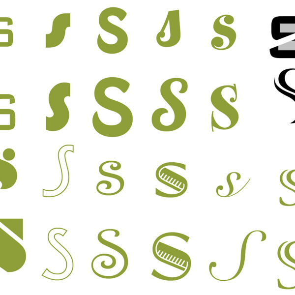
From the old text logo, they wanted to move into a more simplistic logo that looked more corporate and professional. The request was for an "S" only, not all three initials.
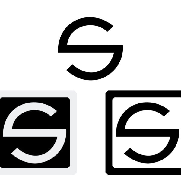
From the "S" ideas, they really liked the "S" with the slash through it, so I worked more with it. Always fascinated by circles, I created an "S" from a circle integrating the slash. That was the winner!
Next came how to present the new "S" with text. The client really liked the Copperplate font which inspired the edges to tie the logo all together. We all felt the non-knockout "S" worked best.


